
Three2One Studios
PROJECT
01
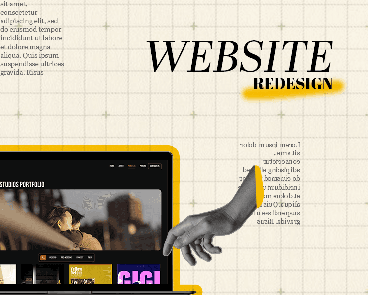
A website redesign to restore flow — simplifying navigation, refining visuals, and resolving key usability issues to make the experience feel natural and easy.
PROBLEM
A Trunk Test across the five core pages surfaced real navigation failures — the nav bar vanished on scroll, so visitors lost any sense of location — and the content read generic: a stock contact form, unclear pricing, an unexplained sample-project section.
APPROACH
Audited local competitor sites for structure and tone, then ran Krug’s Trunk Test page by page, marking each failure on screenshots and sketching fixes straight onto them. Rebuilt navigation persistence, page hierarchy, and content — including a contact form built around what the studio actually needs to quote a shoot.
RESULT
Client feedback after launch confirmed the site now reads as distinct and on-brand — validating the identity work behind the redesign
01
WHAT THE TRUNK TEST FOUND
I ran Krug’s Trunk Test on all five core pages: land cold, and answer where am I, how did I get here, what can I do next. The nav bar disappeared on scroll, so past the first fold there was nothing anchoring you to the site at all. Every page failed the same question in the same place.

Home Page — Trunk Test Findings
Site ID — Clear. The nav shows "Three2One" so visitors know what site they're on.
Page ID — Unclear. Nothing on the page identifies it as the homepage specifically.
Section clarity — Failed. The page includes a "Three2One Studios" block and a "Chance" sample-project section with no explanation of what either is or why they're there — a visitor has no way to tell what these sections mean or how they relate to the studio's actual work.
Local navigation — None present at this level.
"You are here" indicator — Failed. The nav bar disappears on scroll, so once a visitor moves past the first screen, there's no persistent sense of location.
Search / wayfinding — Failed for the same reason — the nav bar is the only wayfinding tool, and it vanishes on scroll.
Bottom line: the homepage passes on basic site identity but fails on almost every orientation cue past the first screen — no persistent nav, unexplained sections, and no page-level identification.
02
CONTACT PAGE FIX
The old contact form asked for name, email and a message — the same three fields as everyone else, and none of what the studio actually needs to quote a shoot. I rebuilt it around the real questions: your name, what are we capturing, what package are you thinking, where is it, when is it, your contact info, tell us about your vision, and anything else to add. Same amount of typing for the client, but now it’s an answerable enquiry instead of a back-and-forth for the studio.

03
SHOWCASE
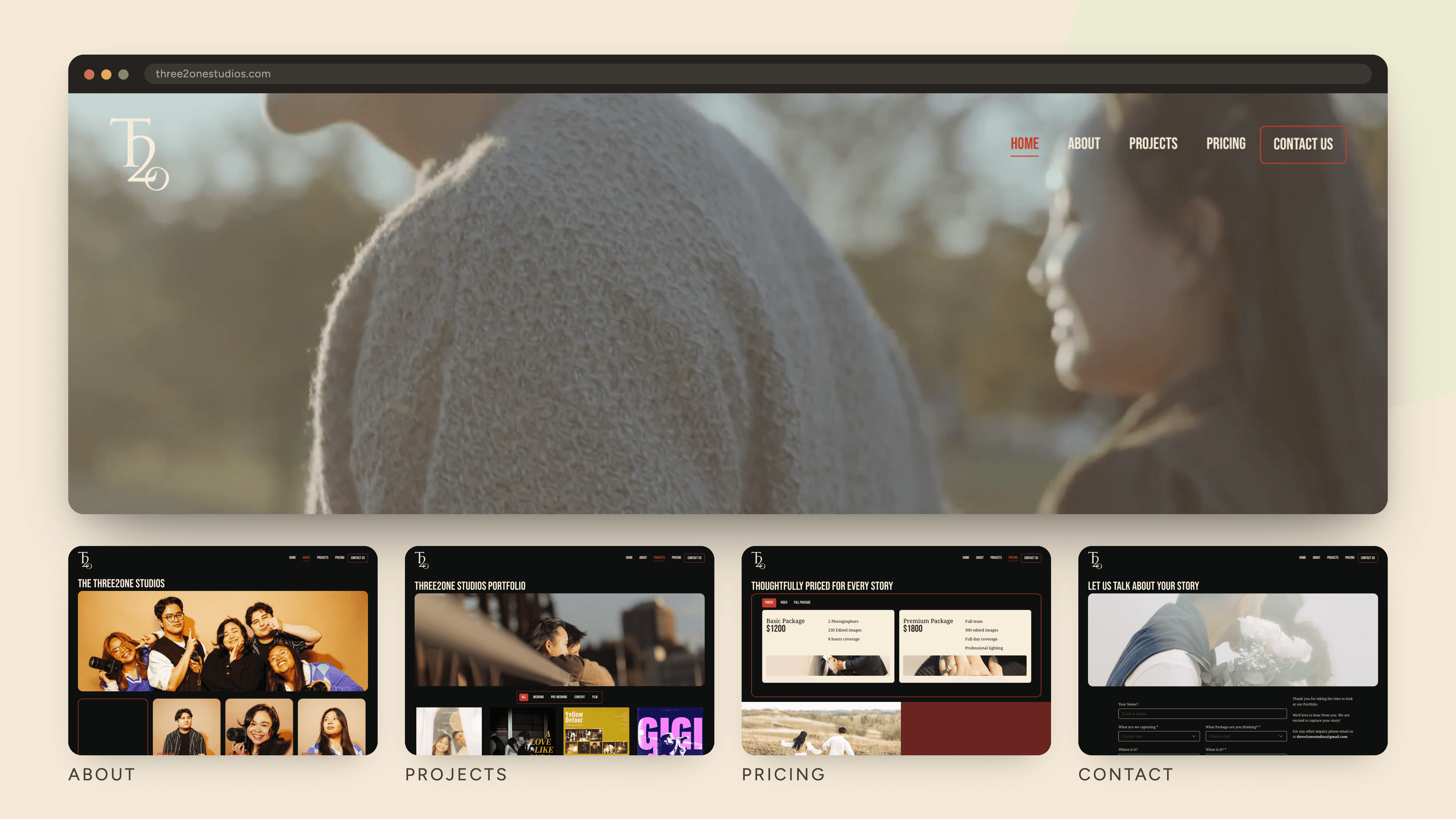
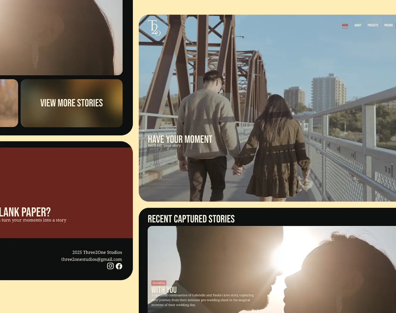
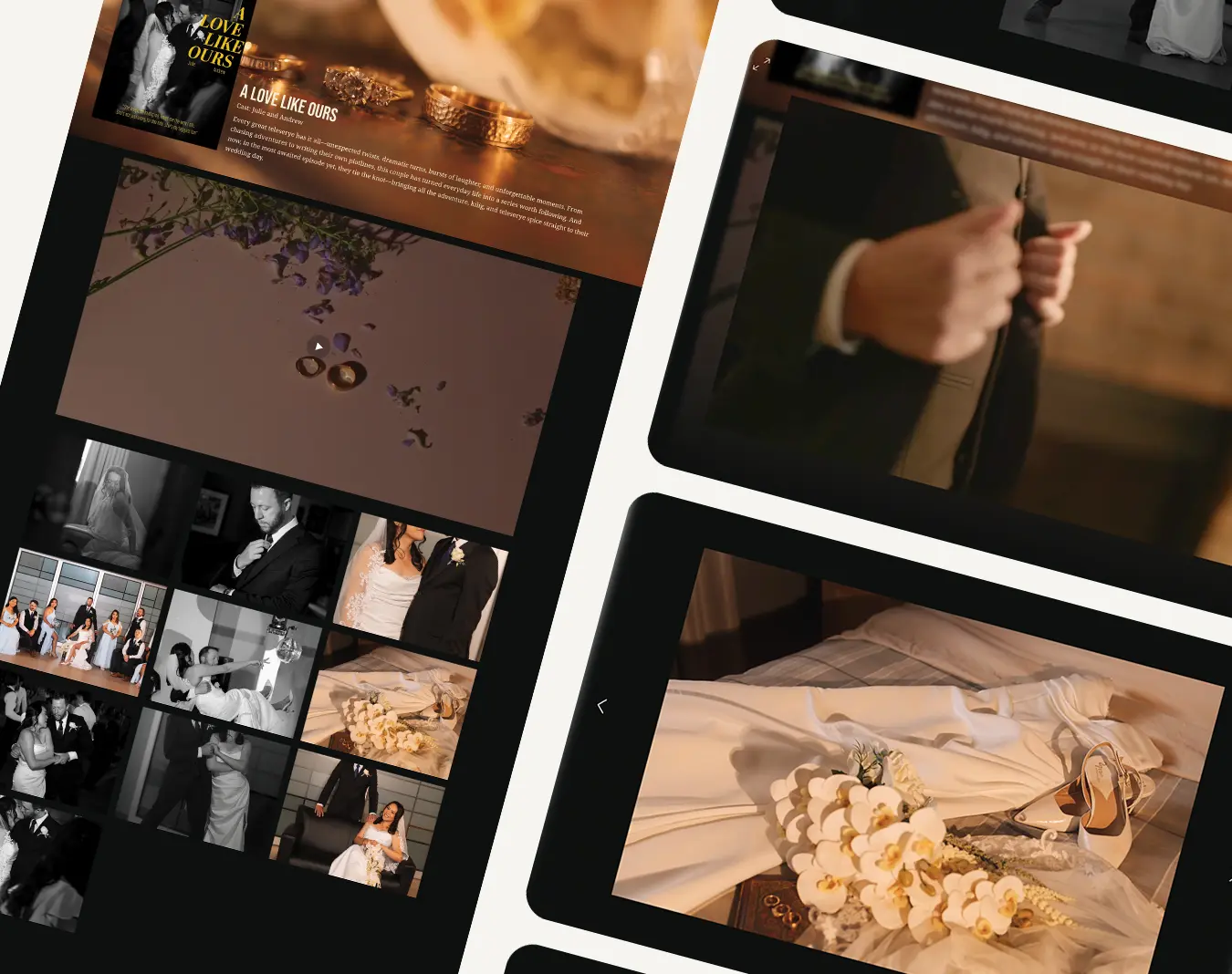
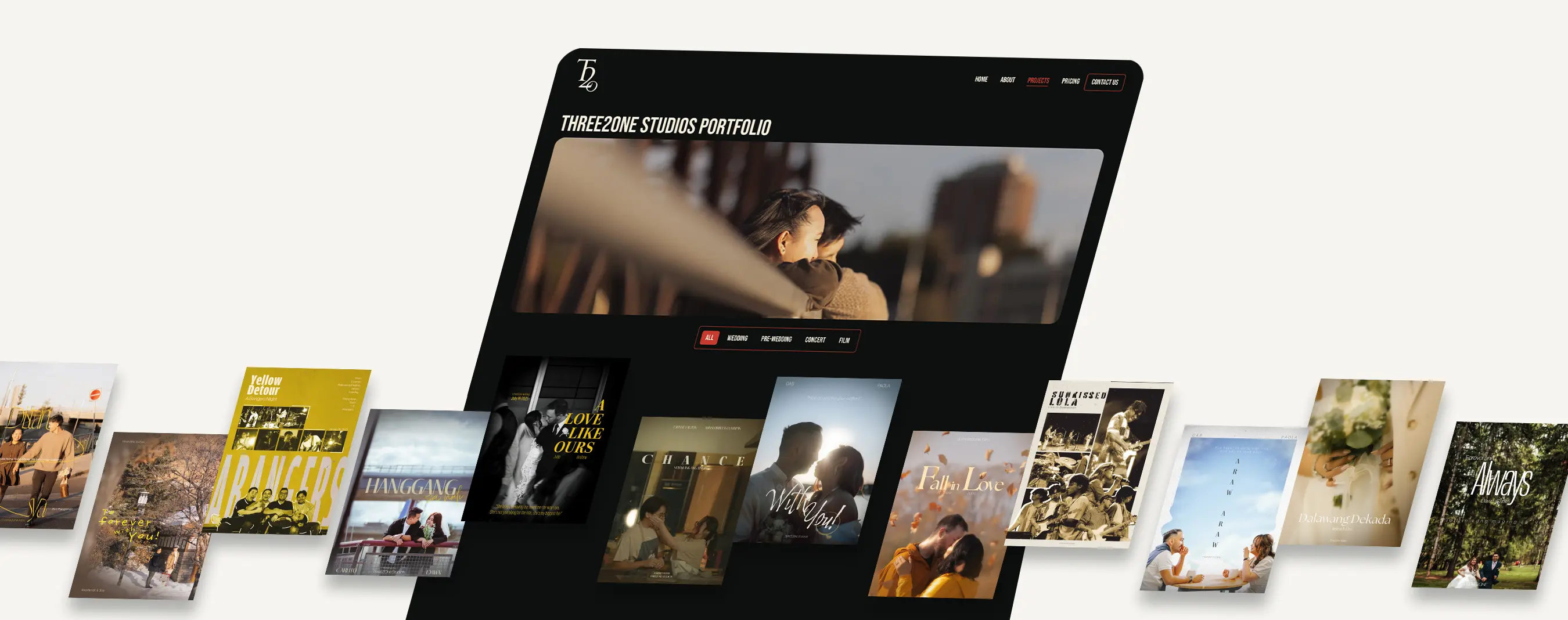
Redesigning Three2one studios’ website